Web, Print & Packaging
THE CHALLENGE
Before Urban Remedy became a health food staple, it was a small storefront in Mill Valley, CA with a founder who believed food could heal and a vision that had already outgrown its shelves. The brand needed to grow up, new packaging, a retail website, and printed collateral that could carry the story from a local favorite to something the whole country could connect with.
MY ROLE
I led the brand identity from the ground up, developing the creative concept, establishing the visual system, and building a brand flexible enough to scale well beyond its starting point. The goal was to hand the owner something that felt as big as her vision, even when the studio was still finding its footing.
THE APPROACH
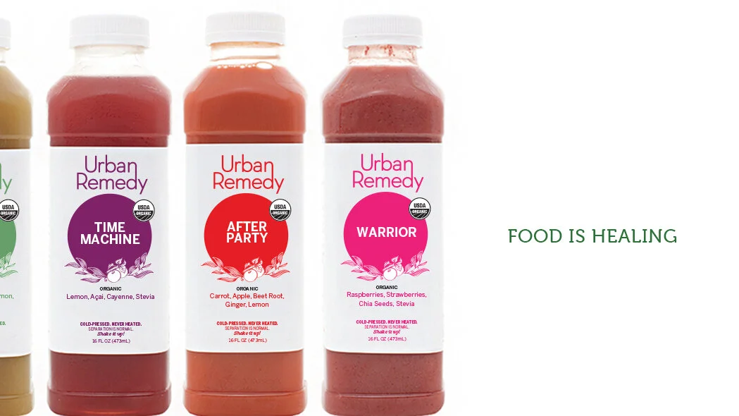
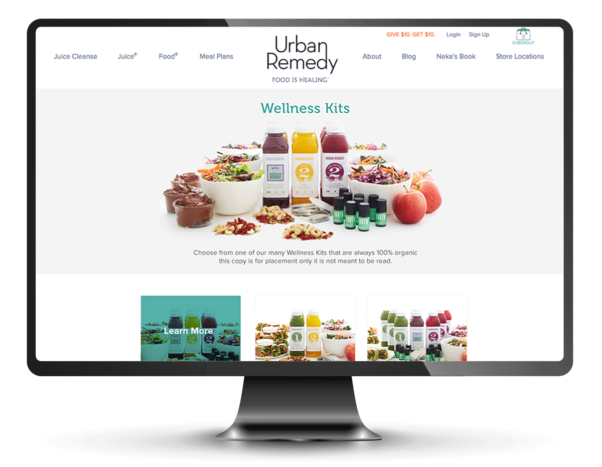
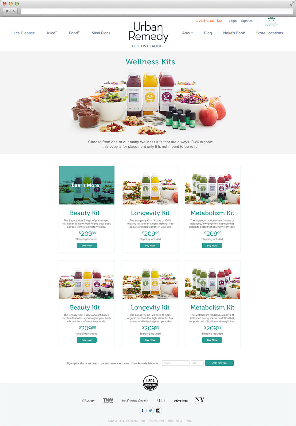
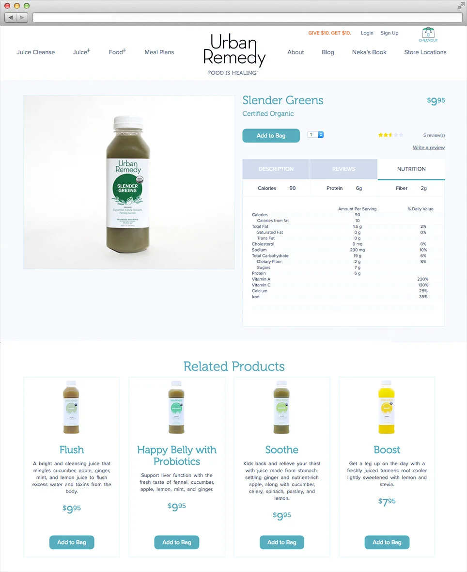
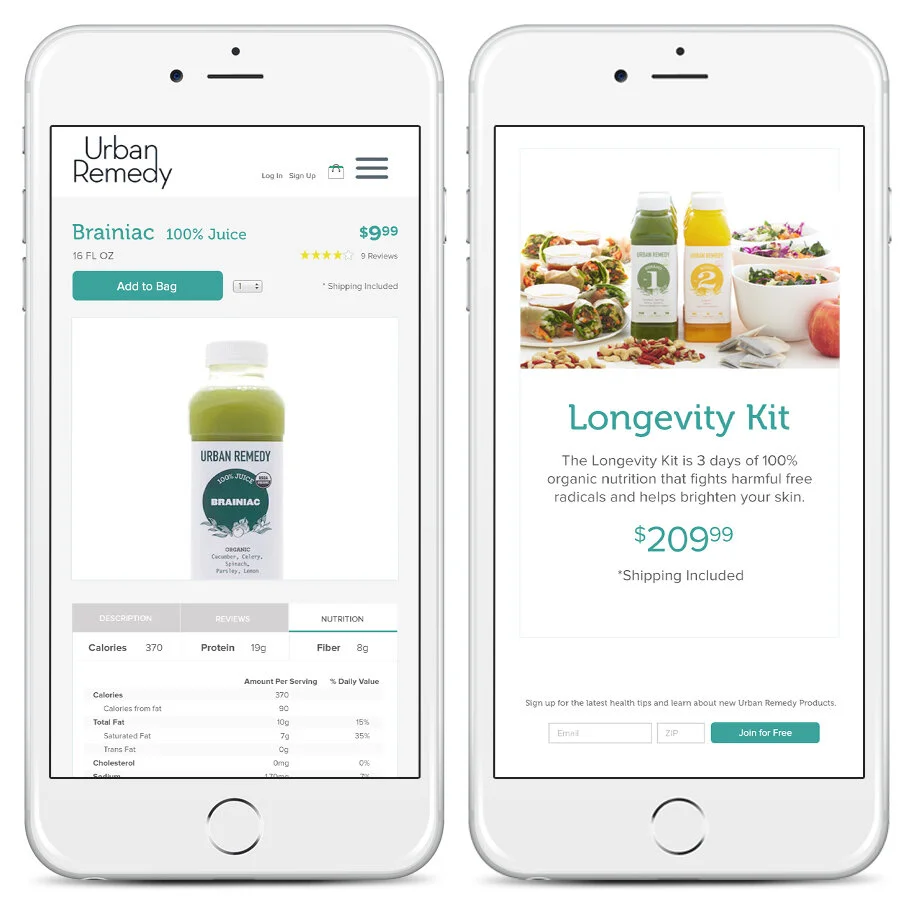
The foundation was already there, we just needed to honor it. Neka's story is the brand: a decade of healing through acupuncture, Chinese medicine, and nutrition, distilled into one simple mantra — food is healing. We built a foundation that felt as clean and intentional as the products themselves. Simple packaging that let the food do the talking. Warm, organic imagery rooted in the Northern California landscape. And a website that made it just as easy to fall in love with the story as it was to place an order. Nothing cluttered, nothing loud, just a brand that felt honest from the inside out.
DISCIPLINES
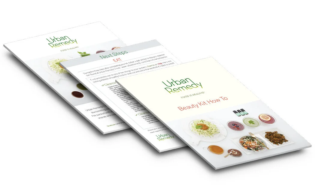
Web Design & Development | Printed Collateral | Packaging Design